
Next year will be different
Predictions, predictions...

On 29 July 2024, Rachel Reeves stood at the despatch box in the House of Commons to deliver her first major fiscal statement as Chancellor.
It was only weeks after the election. The markets were watching, the government was new, and the message was urgent. In that speech, Reeves claimed she had uncovered a £22bn “black hole” in the public finances.
Three months later, in her October Budget, roughly £40bn of tax rises were announced: employers’ National Insurance increased; income tax thresholds remained frozen; inheritance tax reliefs were reduced. The fiscal rules were projected to be met in year five.
In November 2025, the tightening continued. The Office for Budget Responsibility assessed that policy measures would raise around £26bn a year by 2029-30. Headroom remained narrow. The five-year target still held.
Then the scrutiny began. Reports questioned how the £22bn figure had been constructed and how closely the political framing matched the watchdog’s underlying assessment.
But beneath these arguments sat a simple fiction.
Every headline number in that debate - the £22bn gap, the £40bn package, the £26bn yield - depended on five-year productivity and revenue forecasts that have been based on wildly optimistic projections that were wrong year after year after year.
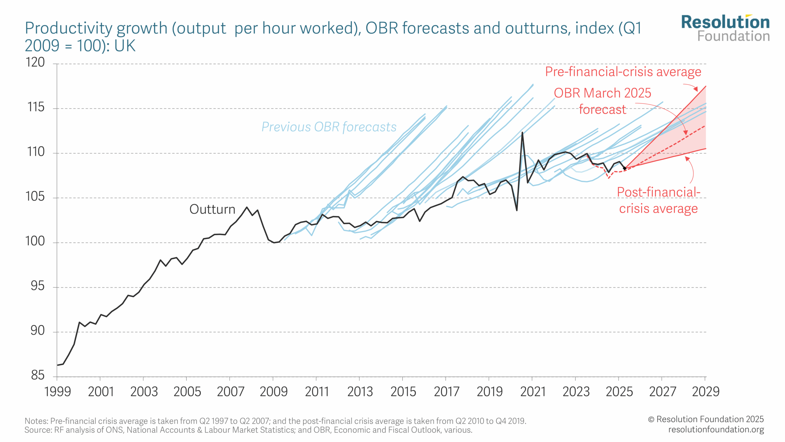
Stop and look at the above chart. Pause and actually look at it.
The black line is reality. Output per hour worked in the UK since the financial crisis.
The blue lines are forecasts made at different points over the last fifteen years. Each one projects productivity forward from that moment.
From 2010 onwards, the projections assume that productivity will begin to grow again at something close to its pre-2008 trend. In the early years, that was a reasonable assumption. The financial crisis was recent. Many economists expected a cyclical rebound once the shock passed.
But look at what happens next.
By 2014, the rebound had not materialised.
By 2015, it still had not.
By 2017, more than a dozen forecasts had already assumed recovery that failed to appear.
And yet the central projection kept drawing the same shape. The line bends upward again. Next year will be different.
We are now eighteen years on from the crisis. The chart contains roughly twenty-five successive revisions. After the first ten wrong ones, they start to edge the level down slightly. Yet, each one still assumes that the inflection point is close.
The false optimism persists.
Forecasting error is inevitable, but persistent directional error is different. When the same mistake is made repeatedly, the question is no longer whether growth will recover, but why the baseline keeps assuming that it will.
What evidence, exactly, justifies the expectation that productivity will suddenly return to trend in the near future? What structural change has occurred that was absent in the previous ten projections?
Nothing. Just wildly wrong predictions, again and again.
And what happens if the line does not turn?
Productivity drives tax receipts and the debt ratio. The £22bn “black hole”, the £40bn tax package, and the projected £26bn a year by 2029-30 all rest on one assumption: productivity growth accelerates over the next five years.
If it does not, the economy is smaller than forecast. Tax receipts fall short. The projected £26bn no longer closes the gap.
More tax rises will follow.
Population Forecasts
The United Nations publishes long-term population projections for every country on earth. They come in three variants - high, medium, low - driven mainly by alternative assumptions about fertility. A rate of 2.1 is needed for a stable population. Small differences in total fertility rates compound, over decades, into enormous differences in population size.
Take Thailand.
In the UN’s 2022 World Population Prospects, Thailand’s fertility rate was projected to settle at around 1.3 births per woman under the medium variant, and roughly 1.1 under the low.
In January 2026, Thailand recorded approximately 39,000 births - down from around 42,000 in January 2025. A fall of roughly 7% in a single year.
The current fertility rate sits close to 1.0.
That is below the UN’s low variant. The one that was supposed to represent the pessimistic case.
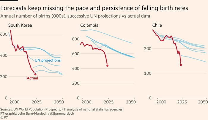
In the chart above, the red line is reality. The blue lines are successive UN projections for annual births in South Korea, Colombia, and Chile.
The pattern is identical to the productivity chart. Each forecast assumes the decline will slow. Each one is drawn from a moment of modest optimism about where fertility is heading. And each one, in turn, is overtaken by a fall steeper than the model expected.
South Korea is the scariest case. The UN’s projections have been revised downward repeatedly. The actual birth count has fallen through the floor of every one of them.
This is persistent directional error. The same mistake, made the same way, for the same reason: next year will be different. The inflection point is close. The line will bend.
It has not bent.
South Korea’s population is currently projected to fall from 52 million today to around 22 million by 2100 under the medium variant. The low variant - the UN’s own pessimistic case - puts it at around 16 million. South Korea’s total fertility rate in 2025 sits at around 0.75. If that rate holds, each generation is roughly 37% the size of the one before it. Two generations from now, the implied population is around 7 million: well below even the pessimistic projection, and the rate has been falling.
Nigeria offers a different illustration of the same problem. In 2012, the UN projected Nigeria’s population would reach 914 million by 2100. By 2024, that figure had been revised down to 477 million, as fertility fell faster than the models anticipated.
Just like that, nearly 440 million people vanish from the model. Oops.
Bad forecasts everywhere…
The pattern is not confined to government forecasters.
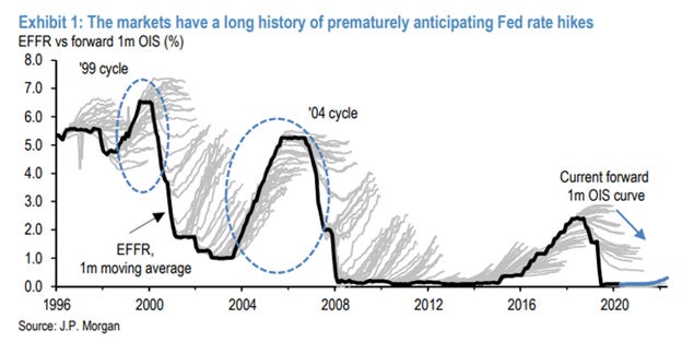
The above chart shows the private sector making the same error. JP Morgan’s forward rates market - some of the most liquid, most scrutinised pricing in the world - has repeatedly anticipated Federal Reserve rate rises that did not arrive, across the 1999 cycle, the 2004 cycle, and beyond. The blue lines fan upward. Rates stay flat or fall. The market reprices. And then, in the next cycle, it does it again. The mechanism generating the error is different from a government spending model, but the shape of the mistake is identical.
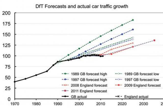
The Department for Transport has been doing the same thing with roads since 1989.
Every forecast projects car traffic rising sharply. Every actual outcome falls below every forecast variant. Across more than two decades of successive revisions, the gap between projected and actual traffic growth has been persistent and directional. The methodology has been updated. The models have been refined. The line keeps pointing up. Reality does not follow.
Migration forecasting has produced the same pattern.
Before EU enlargement in 2004, the Home Office forecast that net annual migration from the eight new accession countries - Poland, the Czech Republic, the Baltic states - would run at between 5,000 and 13,000. The actual figure was around 50,000 a year, a miss of roughly four times the top of the range. The error was large enough that when Romania and Bulgaria joined the EU in 2007, the government chose to publish no forecast at all for what would happen when their labour market restrictions eventually lifted. The lesson drawn was to stop predicting, or at least to stop doing so publicly.
Conclusion
The argument here is not that forecasters are incompetent, or that prediction is futile. It is narrower than that.
When errors are random, they cancel out over time. When they are directional - when the same institutions, using the same methods, miss in the same direction, across decades, across domains, across countries - something structural is producing them. Incentives? The difficulty of publishing a forecast that says things will get worse? The institutional momentum of a baseline that has always assumed recovery?
The question worth sitting with is why the errors, across such different institutions and such different domains, keep pointing the same way.
So when you next hear a politician stating what the economy, public debt, immigration - take your pick - will look like under their amazing new plan, it’s incumbent on us all to remember the forecasters’ track record, and consider the incentives they have for a consistent bias.
Great post. I particularly like the Fed rate chart showing missed predictions
Excellent post. The productivity and immigration forecasts are related, I'd suggest. Productivity won't grow when labour costs are kept down by adding to the size of the workforce, so the incentive to invest in labour saving technology reduces.